
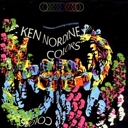
Today's post is a search in the paths of color. I want to share a pretty delightful and unique find: Ken Nordine’s 1966 album Colors. Probably some of you are familiar with his voice, since he has participated in work with brands like Levi’s and Taster’s Choice. Actually this album began as an ad campaign for the Fuller Paint Company, each one running individually as part of a series of scheduled spots (originally just 9 colors), and I imagine it was quite challenge to carry out the advertisement of color in a medium like radio.
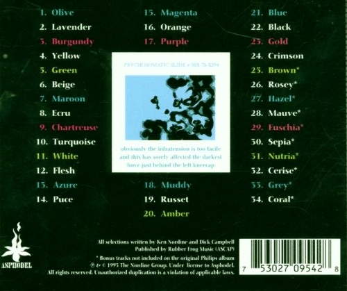
The story goes, however, that the campaign ended successfully. People began to request that the commercials aired again, which led to the eventual release of the collection as an album, this time with 34 colorful poems set to music.
You can now find the album on Spotify, iTunes / Apple Music and YouTube.
It is a great mixture of commerce and art, and in occasions, even involves social and political issues. In addition, what I find truly fascinating in a designer perspective is the capacity to imbue colors with a certain personality. The exercise of imagining a personification of elements like color can evoke rich rich mind pictures about how they make us feel, and in a deeper sense, about how we experience their intrinsic message.
Every color sends a message.
This little musical poems are visceral illustrations of our experience with colors. Lavender is an old lady, accompanied with thrilling sounds of woodwinds in the background:
“Lady of the soft edges, tell us all. Or tell me. Where day goes with night, and what they do there.”
Burgundy for instance, is fat. "Burstingly Burgundy. So fatly soft, so softly fat." There is a play with the music, the tone, and the weight of Nordine's voice, which builds the life of color. Classy Purple, Hip Coral and even peculiar ones like Nutria, "about as unknown as a color can get." The album is filled with a strong dose of storytelling, such as when Blue saved Yellow from being cut from the spectrum. Well, "you know how green can be".
As well, one of the songs hits the designer obsession with white:
“Take a real close look, you begin to see why,
there is much more to white, much more,
than can ever meet the eye.
Sure looks for sure, like that white is called pure.
But it isn’t, not at all.
That’s an off quite white, sorry. Just doesn’t quite measure up. Falls short.
Absolutely pure-pure white, is just a dream of a dream.”
On the other hand, green is dynamic and contains lots of personalities within. Below a nice visual interpretation made by Hutchinson, R. (2013), featuring moving type set to the spoken work of Green by Nordine (1966):
In general, this was a curious and outstanding discovery; it is fun to listen to, think about, and laugh at. Furthermore, it makes you question the inherent qualities we can attribute to certain colors. As designers we are constantly making decision about color, materials and textures, so what if we think a bit deeper and imagine the overall story?
Color can (and does in many cases) construct a statement; it is a representation of something beyond harmony. Its richness and significance is a topic very interesting to wonder about. After all, the more we understand color, the better we can use it to create a more vibrant, beautiful and enjoyable world.