As a creative, it’s fascinating to dig deeper into the origin of the ideas you swim among, so that you might better examine—and even challenge—the values you put into the things you make.
The book User Friendly: How the Hidden Rules of Design Are Changing the Way We Live, Work, and Play, by Cliff Kuang and Robert Fabricant, goes through the journey of explaining how the “user-friendly” concept was invented, how it shapes our everyday rhythms, and where it may go next.
I do recommend going through the whole book (I especially enjoyed the historic perspective), and from it, these are key concepts to consider in the design of user-friendly products:
1. Feedback
Feedback is what defines how a product behaves in response to what you want, allowing designers to communicate with their users without words.
“There may be no greater design challenge for the twenty-first century than creating better, tighter feedback loops in places where they don’t exist, be they in the environment, health care, or government.”
As the authors put it, “feedback is the fundamental language of user-friendly design”, which is a well-known idea in areas of user-experience. However, the big challenge with designing feedback is figuring out when and where to provide it.
“I am awed by the ever-expanding universe of ways designers provide feedback. And yet feedback is often nuisance—just think of the phone alerts that always seem to appear at the wrong time. It turns out that appropriate feedback is a harder design problem to solve than you think, and we are all intuitively aware when it misses the mark”
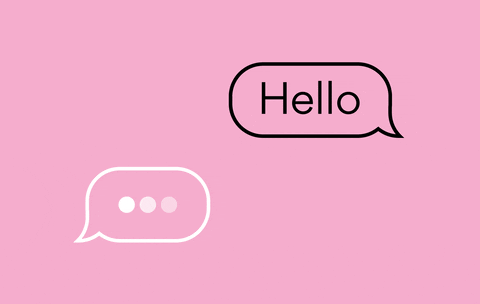
Dots Hello by Equal Parts Studio
2. Mental models
Mental models are the intuitions we have about how something works—how its pieces and functions fit together. They’re based on the things we’ve used before; you might describe the entire task of user experience as the challenge of fitting a new product to our mental models of how things should work.
Almost all of design stems from making sure that a user can figure out what to do, and can tell what is going on. The beauty and difficulty lie in what happens when the object at hand is new, but needs to feel familiar so that its newness isn’t baffling.
We need to understand how products fit into existing ideas and concepts of function, so new tools make sense in people’s lives. Otherwise, they may result too confusing or strange, like promising digital assistants that end up with only 3 percent of people using them regularly after two weeks of buying them.
“Humans might fail—but they are not wrong. And if you try to mirror their thinking a little, even the stupidest and strangest things that people do have their own indelible logic.”
3. Behavior
Behavior is the spine of the user-friendly world, no matter whether you’re talking about smartphones or toothbrushes or driverless cars: a deference to the complexity of understanding people as they live.
“All the nuances of designing new products can be reduced to one of two basic strategies: either finding what causes us pain and trying to eliminate it, or reinforcing what we already do with a new object that makes it so easy it becomes second nature. The truest material for making new things isn’t aluminum or carbon fiber. It’s behavior.”
Similarly, I like the idea of designer Naoto Fukasawa, that the best designs “dissolve into behavior” so that they become invisible rather than stand out for their artistry.
4. Metaphors
Metaphors are a powerful tool for designers and are also linked to our mental models and general understanding of the world.
It is through metaphors that language and understanding grow from simple things to more complex things. We start with things we understand, like the body, and our own simple behaviors, and create new language:
“The human body is a particularly generative “metaphier”, creating previously unspeakable distinctions in a throng of areas. The head of an army, table, page, bed, ship, household, or nail, or of steam or water; the face of a clock, cliff, card, or crystal; the eyes of needles, winds, storms, targets, flowers, or potatoes… and so on and on…
All of these concrete metaphors increase enormously our powers of perception of the world about us and our understanding of it, and literally create new objects. Indeed, language is an organ of perception, not simply a means of communication.”
This extends to everything, including products and technology.
An example is the idea of your email “inbox”, which borrows its logic from your mail, versus social network “feeds” based on streams of constantly flowing content, like a river. You probably at least glance at every email that you receive—simply because they were meant for you.
Streams are entirely different metaphors. It’s there for the taking, if we wish to, not that we have to. It’s a reason why random, multiple messages from your friends on Instagram are okay but they would be rude via e-mail. Each one has its own set of rules but thanks to metaphors we don’t have to list them all out.
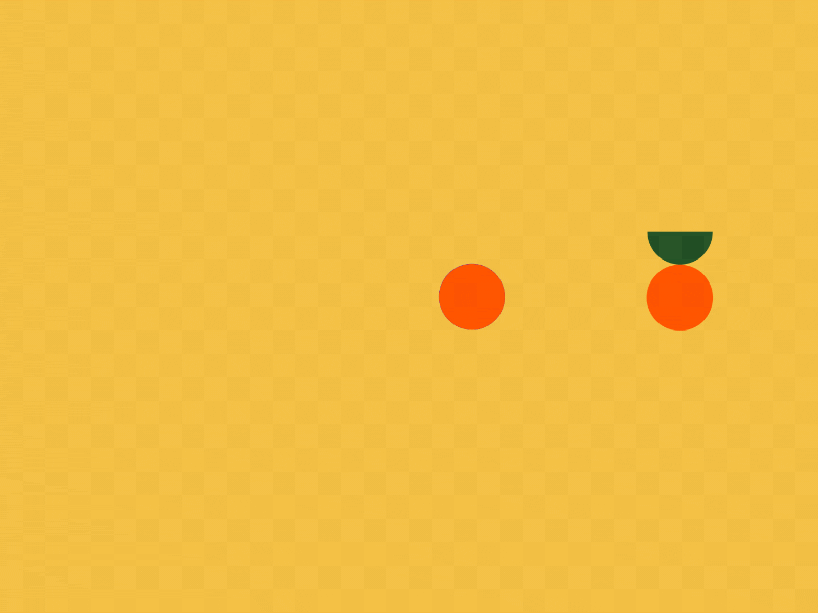
@zambonato
5. Trust
A technology’s success depends not only on the fact of whether it works or not, but whether we trust it, and “the secret is that we come to trust machines only if they mimic the way we come to trust other people.”
Therefore, transparency and clarity are key.
“There are three things an autonomous car has to get right. Above all, we need to know what mode a car is in, whether it’s driving itself or not. [Then] for us not to get surprised, then freaked out by a driverless car, we need to know what it is going to do before it’s actually done. Finally, we need perfectly clear transitions when a car takes control, or when we take control from a car.”
Especially when something is new to use, what may seem like over-communication is crucial to make sure there is an understanding between machines and people, and a clear idea of what to expect, according to the features and limitations of the product.
Accidents with self-driving cars have happened, in some cases, due to a mismatch between what people think (or are promised) the “autopilot” function can achieve, and what it actually does, generating a lack of trust.
Along the same lines, the manners of a product (not living, nevertheless interactive elements) are also fundamental. Designs have to understand what’s appropriate or tactful, or simply nice, because that’s the way humans build trust.
“While politeness seems like a trivial detail, it is a design constraint as real as the heat tolerance of steel or the melting point of plastic.”

Clippy was unconscionably rude, and “a rude machine is worse than one that simply doesn’t work.”
6. “Form follows emotion”
User-friendly design is about much more than usability—many designers are often surprised by how much user satisfaction is driven by the emotional rather than the functional benefits of an experience.
The connection between emotional aesthetics and usability was first documented in 1995 by researchers from the Hitachi Design Center who tested variations of an ATM user interface, finding a stronger correlation between the participants’ ratings of aesthetic appeal and perceived ease of use, even over their actual ease of use.
Not that you have to choose one or the other, of course, but “the right emotional connection with a user can make up for some of the challenges, from poor feedback to a convoluted mental model”, so a beautiful, emotional savvy product will contribute to, or even define, how usable it is.
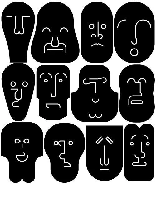
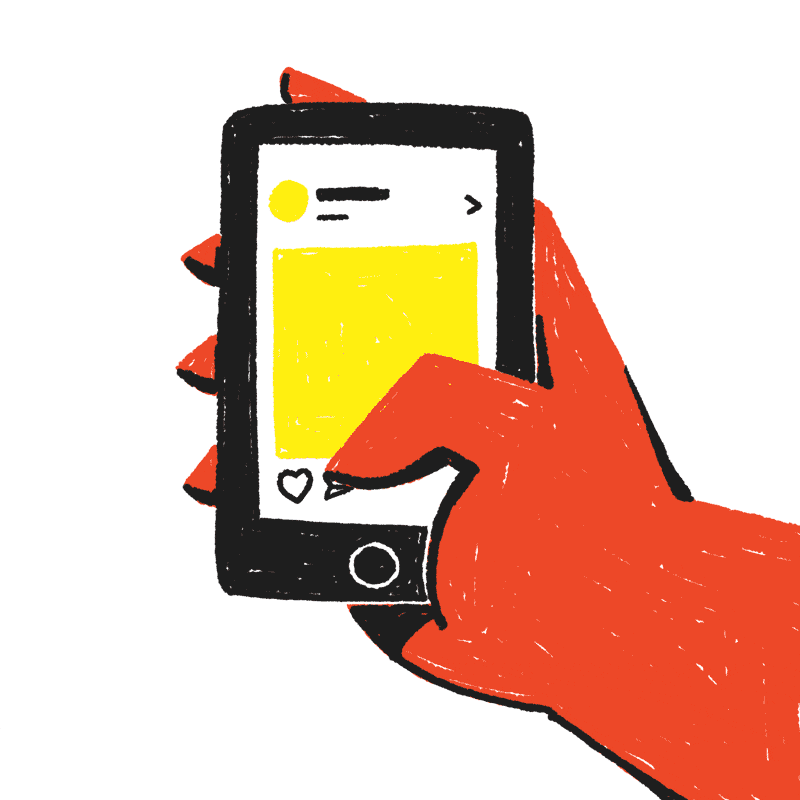
Facce by Stefano Marra
7. Hierarchy of needs
In hiding great complexity behind alluringly simple buttons, we also lose the ability to control how things work, to take them apart, and to question the assumptions that guided their creation.
Modern user experience is becoming a black box: “this is an iron law of user-friendliness: the more seamless an experience is, the more opaque it becomes.”
“A world on instantaneous, dead-simple interactions is also a world devoid of higher-order desires and intents that can’t readily be parsed in a button. While it may become easier and easier to consume things, it will become harder and harder to express what we truly need.”
But human needs are not the same as convenient consumption, yet we have been living for decades assuming they are alike.
“User friendly is about deferring to the desires of the users. But there’s a hierarchy of desires. There’s a sense of wanting to eat that cheeseburger, but there’s also that higher-level desire [...] to be healthy and happy long term.”
It is easy enough for us to tell our phones what we like in micro-detail: whether we like this or that story on our feed, or whether we like a song on Spotify and would like to have similar suggestions. These interactions have been optimized to a fine point.
Yet what we cannot tell our phone is what kind of overarching experience we’d like in our digital lives.
It would be wonderful to have products that help us achieve our bigger goals instead of seamlessly pushing instant gratifications (frequently associated to draining our attention or budget in the package of giving you what you want).
The next phase in user experience should be to change our founding metaphors so that we can express our higher needs, not just our immediate preferences.
“In helping people understand their world better, in creating the incentives and feedback loops for us to achieve better things, user-friendliness will be an assumed part of whatever comes next.”
@yukai_du
References:
Kuang, C., Fabricant, R. (2019) User Friendly: How the Hidden Rules of Design Are Changing the Way We Live, Work, and Play. MCD.